
")
Victor Moscoso, Sopwith Camel
By Garrett Schroeder, Graduate Class of 2027
Victor Moscoso’s neon-colored posters and highly stylized typography epitomize the 1960s psychedelic experience. Born in Spain, his family moved to New Jersey in 1938 to escape persecution from the growing fascist regime. As an adult, Moscoso relocated to San Francisco, California where he joined fellow artists Wes Wilson, Rick Griffin, Stanley Mouse and Alton Kelley, who came to be known as the “Big Five” poster artists. Out of the “Big Five”, Moscoso was the only one professionally trained in the arts, having studied under prominent color theorist and artist Josef Albers, who influenced Moscoso’s use of bright, contrasting colors. Moscoso’s use of neon colors in his posters was not only synonymous with the psychedelic counterculture but also proved an effective, eye-catching advertisement strategy, helping his work stand out amongst his peers. Moscoso was also known for pushing the lettering on his posters to be nearly illegible, explaining that he wanted people passing by to stop and truly investigate his work, figuring out what the typography said.
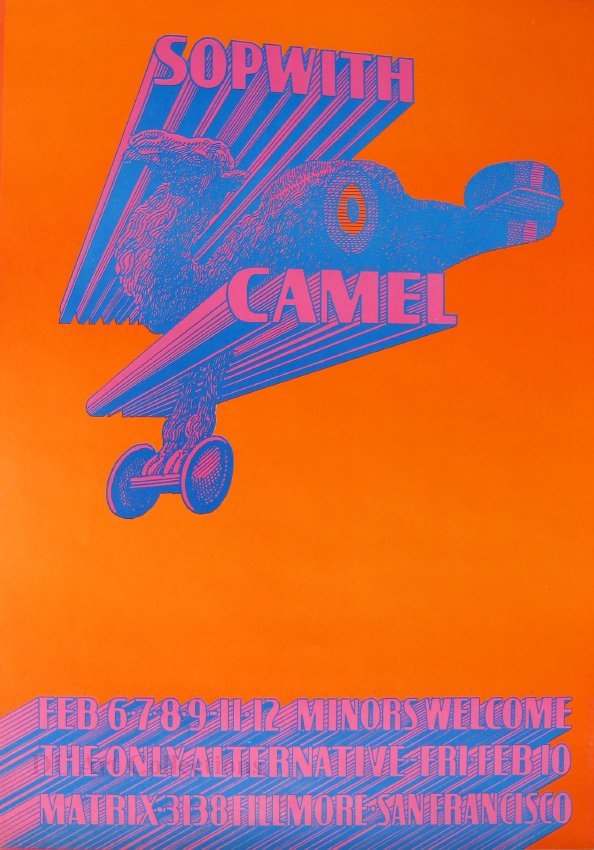
This poster from the University of Denver Art Collections features the band Sopwith Camel. It was printed as part of Moscoso’s own “Neon Rose” series (1966 to 1968), created when he realized he did not need a promoter or publisher to produce his own work. This particular poster has an interesting design based on a pun of the band’s name. The Sopwith Camel was a type of plane, used in World War I, and Moscoso plays with the name by designing an image of a camel with wings, creating a literal representation of the Sopwith Camel name. The band’s name makes up the wings of Moscoso’s plane. Unlike modern-day jets, Sopwith Camels were biplanes and had their wings stacked on the top and bottom of the vehicle. Though the poster featured much more readable typography than many of his other posters, Moscoso created a sense of movement with the letters by adding shadows moving towards a horizon making it seem as though they are moving towards the viewer. The line “minors welcome” was included to advertise a wider and more family-oriented audience, since shows for prominent venues such as the Fillmore West and Avalon Ballroom were previously for adults only. This poster proved so popular that the band used it for their first album. In addition to his posters, Moscoso also worked on a multitude of other projects including album covers, advertisements, and comics that became hallmarks of American counterculture.